
As photographers, we do our best to get perfect shots to save on time and resources in post-production. It’s difficult, however, to spot distortions and color contamination in-camera. Many of us only notice that a subject is overexposed or oversaturated when we’re already viewing the images on a computer.
When color is an issue, you can solve the problem through color correction. You will need Photoshop Elements (an Adobe photo editing software for beginners), Adobe Photoshop (also known as PS and is used by all types of visual professionals), or Lightroom (another robust software made specifically for photographers) to do this.
You can also use color correction to add drama to an otherwise mundane photo. The second half of this article is a tutorial on how you can achieve just that. If, however, you feel that your photo retouching skills still need a bit of work, you can always count on professional photo color correction services like what we offer at Paper Boat Creative.
Capturing Wrong Colors: How Does This Happen?
Inarguably one of the biggest challenges in photography is capturing the exact visual that your eyes see. Modern cameras do a rather excellent job of it, but they’re not perfect. Even the most advanced exposure systems, white balance settings, and automatic color corrections aren’t always 100% accurate. There’s also the matter of lighting. Natural and artificial light can interact differently (sometimes unpredictably) with various colors and surface textures.
Let’s go deeper into the possible reasons behind color inaccuracies in photos.
- Your Camera
Our eyes are the perfect cameras: they can absorb colors and see the real effect of light hitting another object. With photography, it’s a man-made distortion that attempts to see what we see. But it’s not perfect—at least not yet.

If you’re using an automatic camera for shooting, you’ll most likely get a hyper-realistic image: the skies look very blue, trees are a vibrant emerald color, and sunsets have deep orange horizons with streaks of rose, indigo, and soft yellow—possibly with a bit of white and blue peeking through.
Automatic cameras can be great for home photography, but when it comes to precise color balancing for skin tone or objects, the images they capture can be off the mark. They tend to over-saturate or increase the brightness of an image. In most cases, these auto-settings don’t capture the natural drama of the landscape you’re taking photos of.
TIP: Avoid muting a warm color palette by setting the automatic camera on manual mode. Adjust the white balance by changing the Kelvin settings. The higher you go, the warmer the color temperature will be (note that “warm” can also add a yellow hue to a photo, and setting the Kelvin too high can make your subjects look jaundiced). Conversely, you can achieve a more neutral or even cooler temperature by lowering the Kelvin.
Experiment with the settings and observe how the colors change through your camera screen.
- Your Choice of Lighting

Natural lighting is ideal, except when it is so harsh that it washes out the colors in the frame. Common examples are outdoor photos wherein the subjects are facing the sun. Thanks to overexposure, the eyebrows are barely visible, their eye colors are indeterminate, and some lighter colors (perhaps in their clothing) don’t register at all.
Your camera, in relation to the natural light, can also affect how the colors appear on your photos. A sunset shot can look more red and orange, and sometimes it goes a bit too much in that direction. So if you see a fantastic sunset and you’re wondering why your image on your camera isn’t as fabulous, it might be because your camera is trying to auto-adjust.
Artificial lighting, meanwhile, gives you greater control over how light affects colors. It can, however, also get tricky.
There are four kinds of artificial lights usually used in photography, and each of them can skew the colors on your photos:
- Florescent – These lights tend to give off a blue or green shine, so photographs with these lights will be on the cold side of the spectrum.
- Incandescent – These lights are warmer in color, like yellow or orange, and ordinarily hot to the touch.
- LED – These mimic the pure white light of the sun, but it’s still not pure white light as it can creep incrementally either to warm or cold tones.
- Studio Strobe or Flash Lighting – These are bursts of immensely bright light that flash a fraction of a second. When used inexpertly, it could overexpose a photo the same way that high-noon sunlight could.
TIP: Take gorgeous landscape and portrait photos outdoors during the Golden Hour, that time of the day when the sun is between six degrees above the horizon (sunrise) and four degrees below (sunset). The distance between the sun and the earth is the farthest at these angles.
Now in photography, the more distant the source is, the softer the light becomes. It’s why The Golden Hour is considered the best time to take photographs outdoors: you get a subtle and diffused “golden” temperature that casts a soft light over your subject. Position your camera just right, and you can capture a dramatic transition of warm to cool colors in one frame.
3. Your Props

Have you ever walked near a green background, and notice that your skin color seems to be paler all of a sudden? Or have you walked near a night lamp and noticed how your face glows yellow, making even your eyes and hair glow yellow as well? That’s because objects reflect light off of each other, as well as color.
Paper Boat Creative does studio photoshoots and receives RAW files from clients, so we have seen a lot of pictures taken in practical sets. In photos where models stand against colored a background, we’ve seen that their skin also reflects a little of that dominant color.
TIP: Unless you intended for the light to bounce color off of your model, consider using a plain white background during your studio photoshoots. You can later add a creative background, and other elements, in post-production. You can also take things a step further and manipulate the color palette for a high-impact effect. Paper Boat Creative’s color correction services can achieve it for you.
Feel free to contact Paper Boat Creative about adding dramatic effects to your photos using color correction.
Tutorial on Precise Color Photo Editing
Let’s now get to the nitty-gritty of photo color correction and how to use it to make beautiful photo effects.

Here’s a photo of what we’re trying to correct. You might think nothing’s wrong with it, but then you need to ask: Where do we want the photo to go? What mood do we want for the image?
In this particular case, we want it to look as if the model is in front of a soft pink sky, running at the crack of dawn, with a misty haze over the whole photo. We want it to look soft and dramatic, so we need to adjust the color balance, among other things.
As it is, the photo is a bit yellowish, so we began by adjusting the white balance of the image. That means making sure that the whites and grays in the image register as pure white and gray.

Now you will see that the photo is much better because we reduced the yellow cast on the image by adjusting and white balance. Since we wanted to put her in a pastel background under a sunset setting, we added some colors that would blend her well to the background.

Next, we added color grading using the Levels tool to help the subject blend well with the background. At the same time, it added a bit of contrast that made the subject pop out more in the overall image.

We then added some masking for a haze effect.

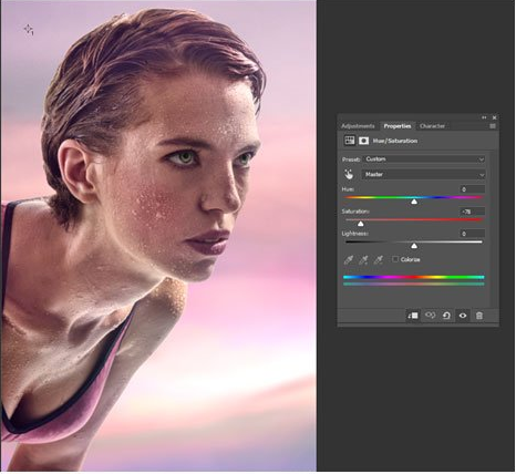
Here is a close-up of how the skin looks after the adjustments above.

We also took the original colors of the new sunset and carefully mixing them into the background.
And after a few more tweaks, we came up with this final photo:

Color correction is one of the primary steps in photo enhancement. Besides ensuring the accuracy of the colors, it can make your photos look artistic, dynamic, and better overall.
Creating photo effects through color correction is a forte of Paper Boat Creative. Inquire about our color correction services today.